What is chartreuse color and how to use it in interior design? Is it fashionable and trendy or a timeless classic? Let’s have a closer look at this original color and how it can be incorporated in modern home interiors.
The color gets its name after the famous herbal liqueur “Chartreuse” which was invented by the monks of the Carthusian Order. The monks use a 400 year old recipe which is a secret blend of 130 herbs and plants. For a very long time the liqueur was considered to be an “elixir of life” and cost almost a fortune. This famous drink comes in two varieties – Green and Yellow Chartreuse liqueur – respectively we have yellow and green chartreuse colors.
What color is chartreuse?
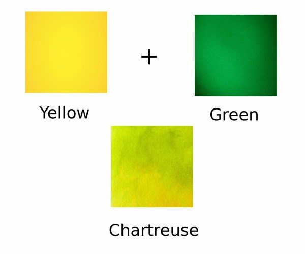
Chartreuse color is unique as it is a mixture of equal proportions of green and yellow. It is not only original and attracts attention, but also has the soothing effect of relaxation. The color is truly unique because it is practically the only shade that works both as an accent and as a neutral. As we mentioned the color comes in different shades and is sometimes describes as apple green, lime green or mellow yellow.
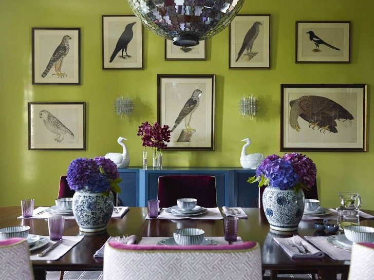
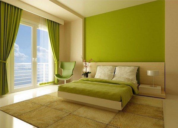
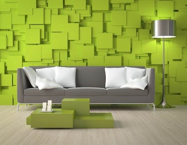
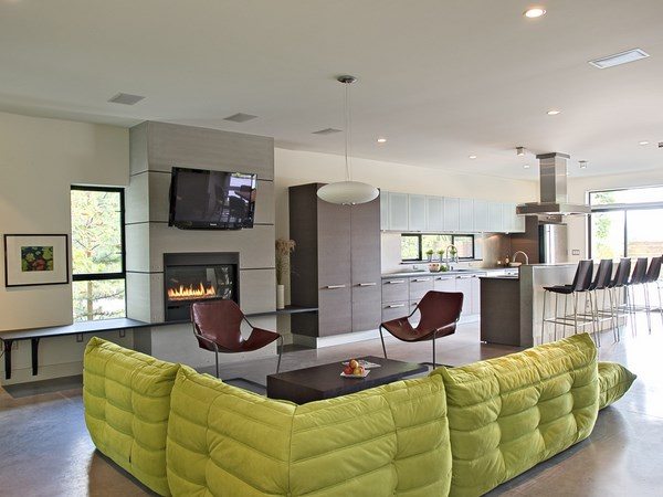
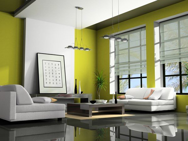
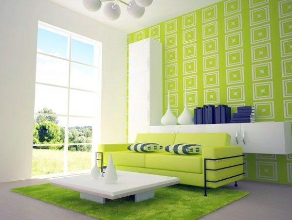
The most common shades are “lime” and “green apple”. The first one is more saturated and therefore it is more suitable for individual pieces of furniture and definitely will work with interiors in modern style. The “green apple” shade is calmer, softer and is a great choice for large surfaces (as wall paint, for example) and works in an excellent way with midcentury modern designs.
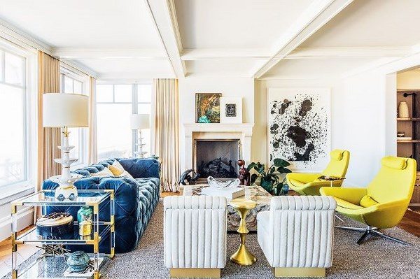
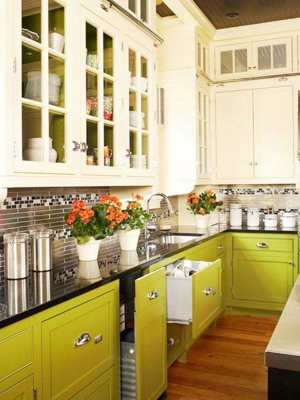
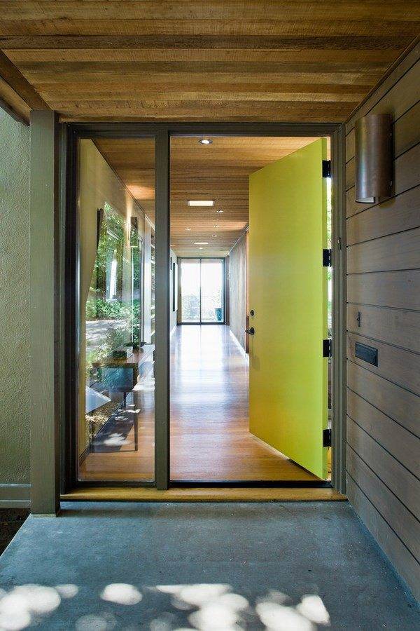
Usually, these extraordinary shades are used in kitchens, living rooms, hallways, home offices, bathrooms. In children’s room the gentle and calm yellow-green shade is very often combined with pastel colors. In living rooms and hallways you can use it successfully in textiles, sofa upholstery, armchairs, curtains, rugs. In the kitchen Chartreuse can be used as the main color of the cabinets or in a dual colored kitchen or as a spectacular and vivid accent of the backsplash.
How to combine chartreuse color with other colors?
Using chartreuse color in interior design often involves a variety of combinations. Depending on the desired effect, you can use it as a main or as an accent color. However, if you wonder how to combine chartreuse color with other colors, here are some useful tips.
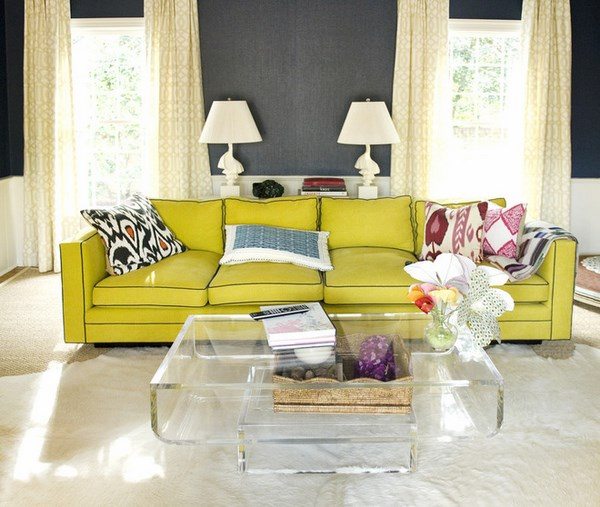
Ideally, like any other shade, chartreuse works perfectly with white. In this case, it stands out and will be appreciated by anyone who enters the room. It works perfectly with sand, cream, blue, gray and pastel shades and creates beautiful, tranquil and harmonious combinations. A combination with light yellow, turquoise and blue is very fresh and vibrant and an ideal choice for a summer atmosphere. Combinations with black, dark purple or dark blue are quite bold and it is better if you used the more acidic shades of chartreuse.

