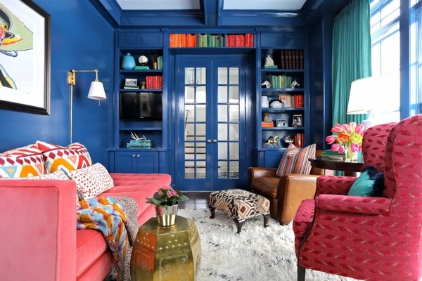
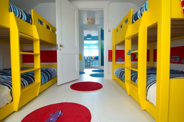
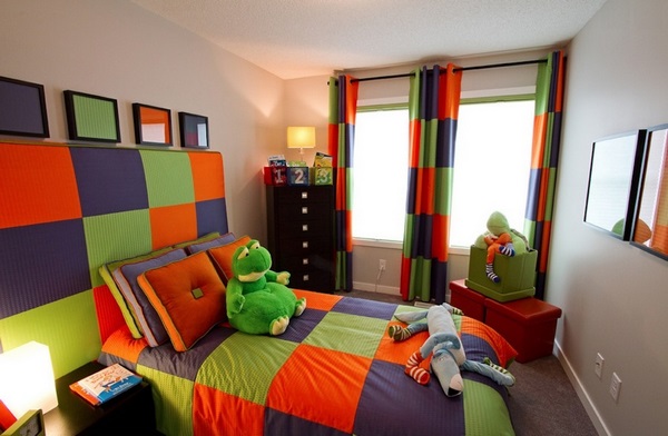
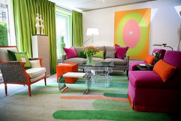
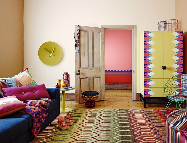
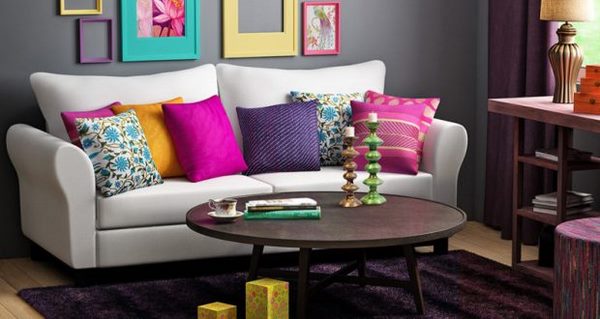
What is triadic color scheme and how to use it in interior design? With the help of colors you can create a certain mood, draw attention or make a statement, they can be exciting or depressing but color combinations are much more powerful. Choosing the right color scheme allows you to create an atmosphere of elegance, a playful and vibrant mood, bold, dramatic or romantic interior. Colors are your most powerful design element, if you learn to use them correctly. There are several basic schemes. Each of them has its own name and is compiled according to certain rules and they are used not only in interior design, but in any type of design – from fashion to advertising, movie posters and computer graphics.
The color wheel or color spectrum is the main method of combining colors. Many professional designers, stylists, image-makers and make-up artists use the wheel as it helps to competently combine shades. The color wheel is designed in such a way that if you choose any colors from it, they will look great together. Over the years, many different variations have been created, but the most common version is the color wheel which consists of 12 colors.
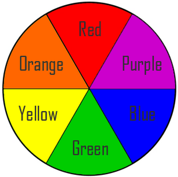
The primary colors of this wheel are red, blue and yellow. Between these three primary colors are mixed colors, called secondary: violet – between red and blue, orange – between red and yellow and green – between yellow and blue. A very important thing to know is that dark or light colors, as well as their shades and tones, do not change their position on the wheel. Orange can range from dark brown to bright orange or pale pink and all of these will be orange as far as the wheel is concerned.
Understanding the triadic color scheme and its variations
A certain number of combinations (two or more colors) that look particularly harmonious and beautiful are called color schemes. Color schemes may sound confusing but the truth is that it is not so difficult to understand them. Despite the numerous shades, the organization is quite simple and there are several schemes. We have explained the analogous colors and triadic color scheme is just as easy to understand.
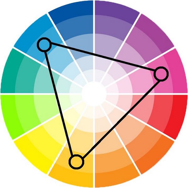
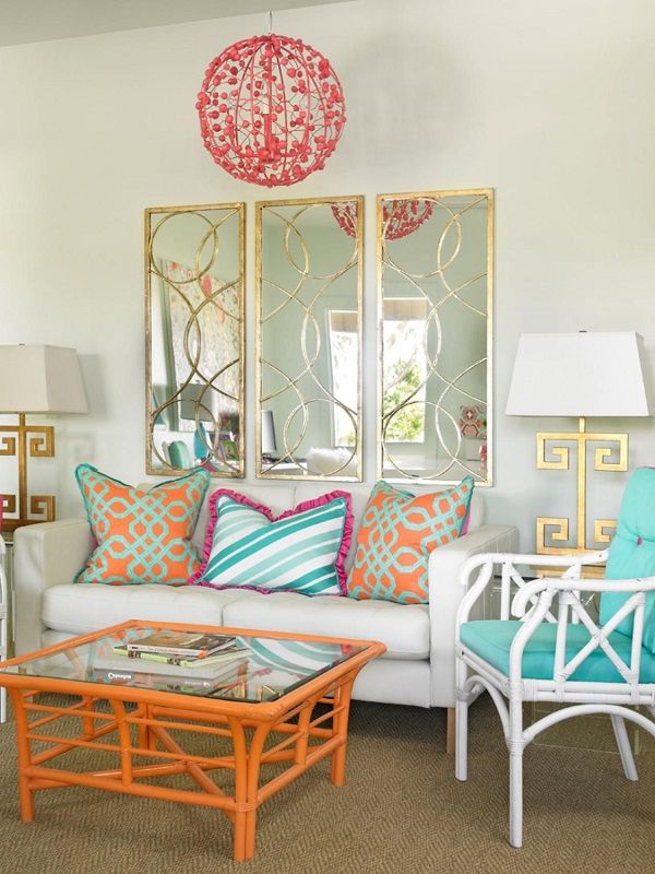
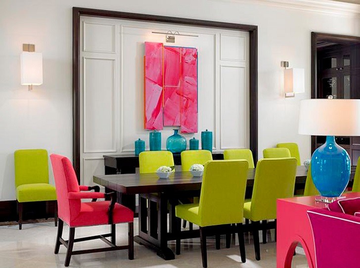
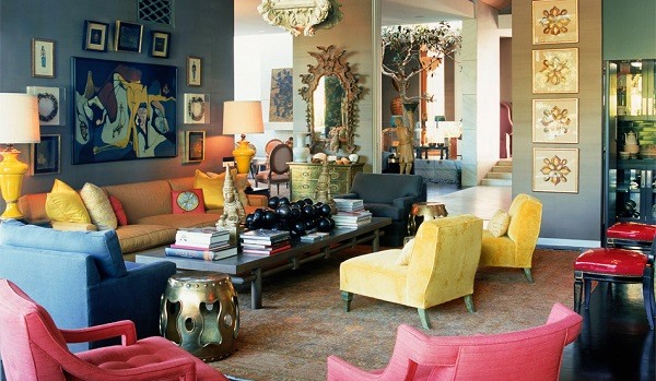
You may hear that triadic colors are the choice of the bold and this is quite true. This scheme is extremely daring and combines colors located in entirely different parts of the wheel and forming an equilateral triangle and thus, you increase the range of color harmony. The combination allows you to achieve strong visual contrasts so when you want to use the triadic harmony successfully, the colors should be carefully balanced and only one should dominate while the other two should be used as an accent.
Triadic color scheme has its variations.
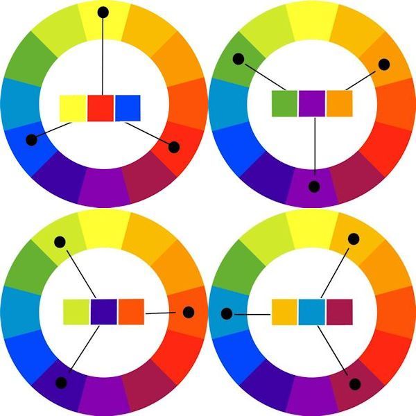
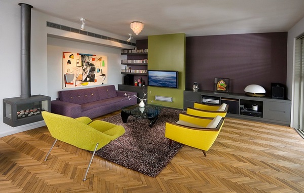
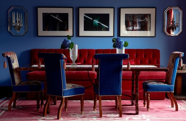
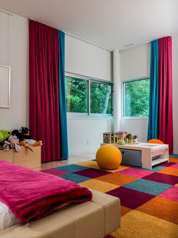
The classic triad features shades that are spaced from each other by an equal distance. Red, blue and yellow form one of the most popular triadic schemes. Another popular combination is violet, orange and green. These combinations are very popular for the interior design of children’s rooms, kitchens, as well as rooms of general purpose – dining rooms or living rooms.
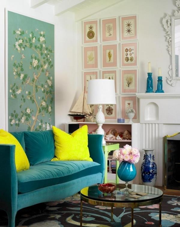
Similar color triadic scheme is another variation which features colors and shades separated by only one space between them. For example, blue-green, blue, blue-violet or purple, violet, red-violet – using similar triadic shades provides numerous opportunities to create a cool or warm atmosphere. When choosing such a scheme, you should remember the main rule that the room will look more harmonious and balanced when one saturated hue is selected, while the others are additional, supporting colors. These secondary shades should be more relaxed and muted.
The contrast triad features one basic color and two adjacent to its complementary ones. For example, if you choose green as a main color, its contrast is red, so you should take red-orange and red-violet. Another example is the combination of yellow, blue-violet and red-violet. Interiors decorated in this color scheme are quite unusual, fresh and dynamic.
How to use a triadic color scheme in interior design?
A perfectly designed interior requires experience, talent, a sense of balance, proportion and of course, colors. When choosing your scheme, you need to first determine the main color. This is the dominant color of your design and your starting point. Here are some of the most popular triadic color schemes:
- Violet, orange and green
- Yellow-orange, blue-green and red-violet
- Blue-violet, yellow-green and red-orange
- Red, yellow and blue
Practical tips and design techniques which will help you create a harmonious and balanced interior:
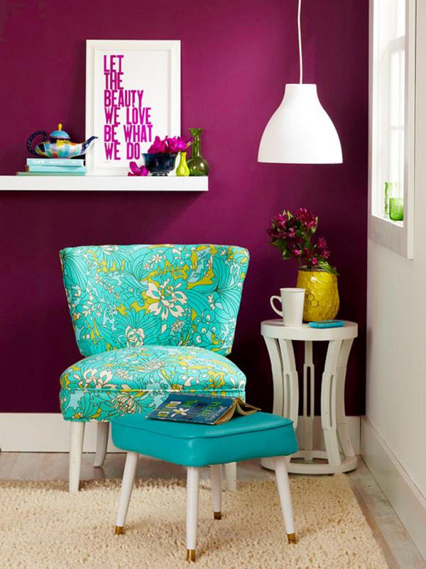
Do not use more than four colors in one room – one or two main and two additional ones. This is especially important for small rooms where an abundance of shades makes them look overloaded and narrower.
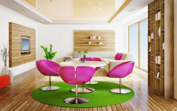
It is best if you use black, white or gray when you want to smooth the overall impression. Gray is the perfect background in a room with very bright accessories and furniture.
Use vertical interior objects of neutral shades to divide the different colors in a room – high vases, floor lamps, flower stands, etc.
Remember that artificial light often changes the perception of color, and the brighter it is, the more it changes.
Use the wheel as it will help you choose the perfect combination for your interior. Do not be afraid to experiment and come up with a new, individual approach, express yourself and demonstrate your individuality!


