Analogous colors and analogous color schemes are really easy to understand. It is true that the sense of color and style is not given to everyone. How do designers combine colors and achieve such ingenious combinations? How do they work so freely with shades and tones and achieve striking visual effects? Is there a formula for this or is it just a talent? Not all interior designers are born artists. Some of them are better in combining elements, others are very good in shapes and spaces. Fortunately, the theory of colors exists precisely for this purpose – to gain an objective idea of the basic colors, the principles of their combination, and the ways that they combine harmoniously. These basic rules apply not only to the interior of the home but to fashion, the choice of accessories, make-up, etc. It takes years of practice to turn the theory into a natural reflex and all designers and stylists are guided by these rules of color combinations.
The first color wheel (color circle) was developed by Sir Isaac Newton in 1666 and is a diagram based on the three primary colors – red, yellow and blue. The basic diagram was developed over the years and many variations of the basic design have been made but the most common version is a wheel of 12 colors – three basic ones (red, yellow and blue), three secondary (green, orange and purple) which are obtained by mixing two primary colors and another six tertiary, which are obtained by mixing primary and secondary colors.
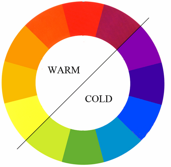
The color wheel is usually divided into warm and cold colors where the cold ones are calm and soothing while the warm ones are energetic and vivid. Black, white and gray are considered to be neutral and they are used to create a variety of tints, shades and tones. By adding white to any color you create a tint, adding black creates a shade while adding gray creates a tone.
Analogous colors and analogous color schemes – how to recognize them?
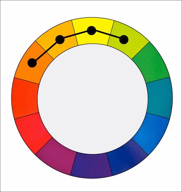
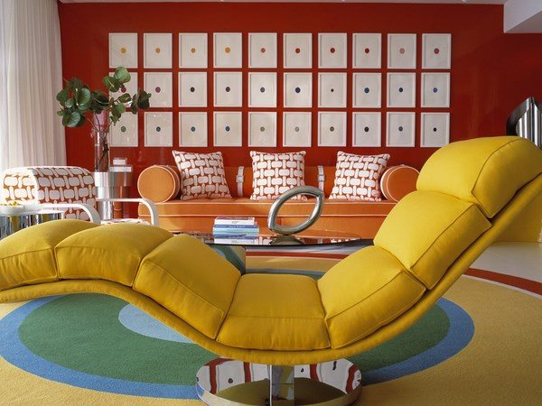
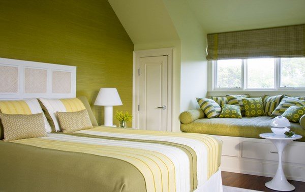
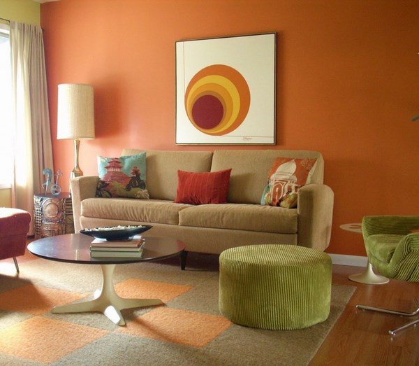
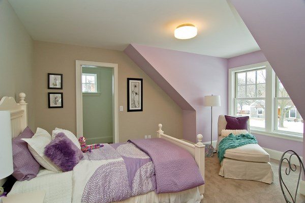
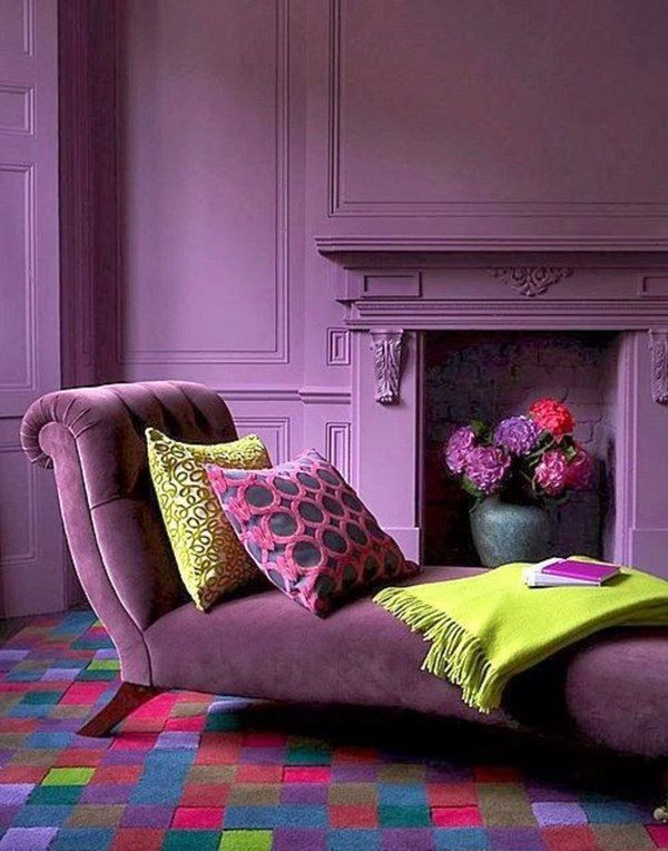
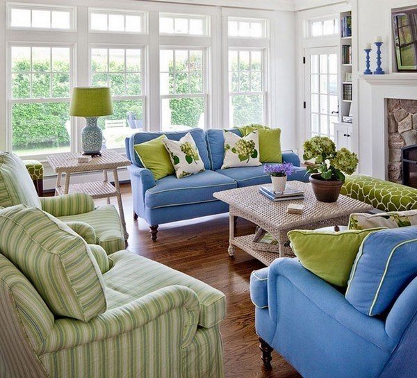
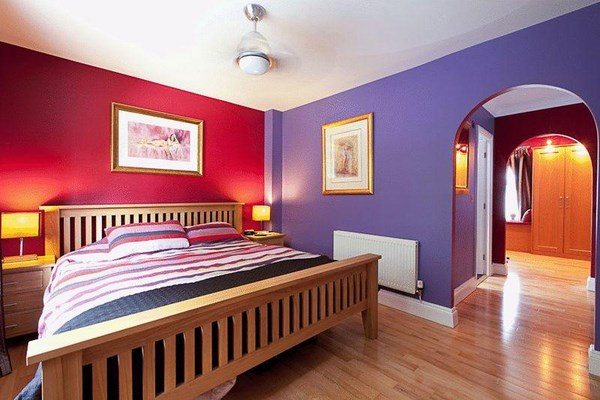
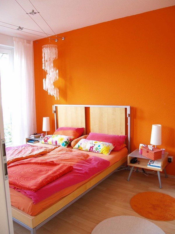
Now that we explained the basics of the color wheel, let’s give the answer to the question – which colors are analogous and what an analogous color scheme is? Analogous colors are the colors located next to each other on the color wheel. Their combination is harmonious and creates a cozy and visually pleasing effect as they usually look good in one frame. It does not matter which range of neighboring colors will be combined. Whether red, red-orange and orange or purple, red-violet and red, the combination of these similar tones gives an interesting, harmonious and slightly monochromatic look to any room in the house. Using an analogous color scheme is based on avoiding contrasts so the colors are either from the warm half of the wheel or the cold one. Avoid the use of too many similar basic colors because it can ruin the harmony. Analogous schemes works best with up to five colors but it is recommended to limit the choice to three. When using three neighboring colors, one is used as a dominant and the others are used to complement the scheme. The main advantage of analogous color schemes is that they look richer than the monochromatic schemes and are easily created. As a disadvantage, one can point out that this type of color scheme lacks contrasts and is not as vibrant as the complementary color schemes.
How to use analogous colors in interior design – examples of analogous color schemes
Everyone wants to turn their new home into a dream come true, with a unique interior that is elegant, inviting and cozy. There are so many choices you have to make when you design the interior of a home – from the best flooring options to choosing the type of furniture and its layout in the rooms. However, before you complete each of these tasks, you must take the most important decision – what color scheme to choose. Color is very important in interior design. With its help, you can visually increase or decrease the space, make the atmosphere calm or bright. A spectacular interior design can be created by using different color schemes. Every room in your home has a different purpose and will most likely have a different color scheme. The main goal is to achieve a harmonious and balanced color combination. Of course, we all know that colors affect our mood and depending on the atmosphere you want to create you can choose one or another from the cold or the warm part of the wheel. For example – yellow is a cheerful, bright color, while red is stimulating, exciting, warm and associated with passion and love. Orange symbolizes warmth and autumn comfort while blue is cool and green has a soothing effect. Here are some practical tips that will help you to create an analogous color scheme:
- The first step is to choose the color range that you want from the color wheel.
- Determine which hue will be your main (dominant) color. There is no need to work with basic (simple) colors. You could use shades or the pastel varieties.
- Before applying any paint, it is a good idea to mix some colors and test them on the wall.
- Do not forget that black, white and gray are neutral colors which can help you create a variety of hues, tints and shades.
Now let’s look at the most popular analogous color schemes. Four major groups of related colors are distinguished on the color wheel: yellow-red, blue-red, yellow-green, blue-green. Here are some options:
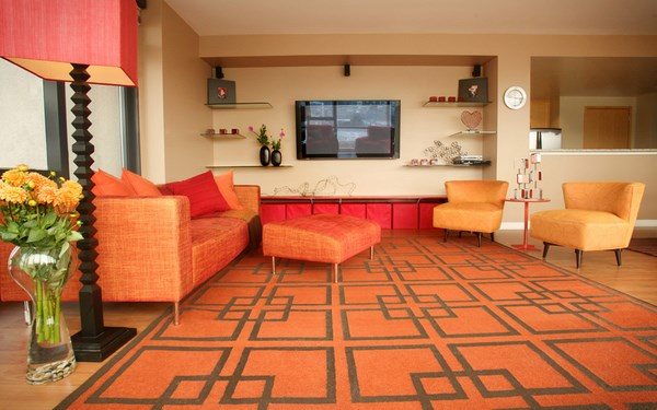
- Red, Red-Orange and Red-Violet;
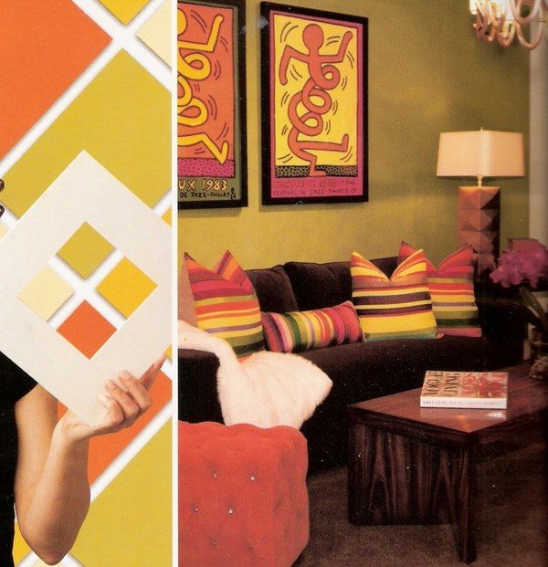
- Yellow, Yellow-Orange and Orange;
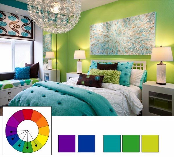
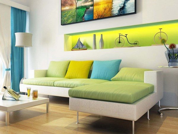
- Blue-Green, Green, Yellow-Green;
- Blue, Blue-Violet, Violet;
- Red, Red-Orange, Orange;
- Green, Yellow-Green, Yellow;
- Blue, Green-Blue, Green.
As you can see, it is not very difficult to combine the colors harmoniously. With the help of these simple rules and design techniques you can easily determine everything – from the color of the walls to the color of your bedding set as it also a part of the interior, isn’t it?

