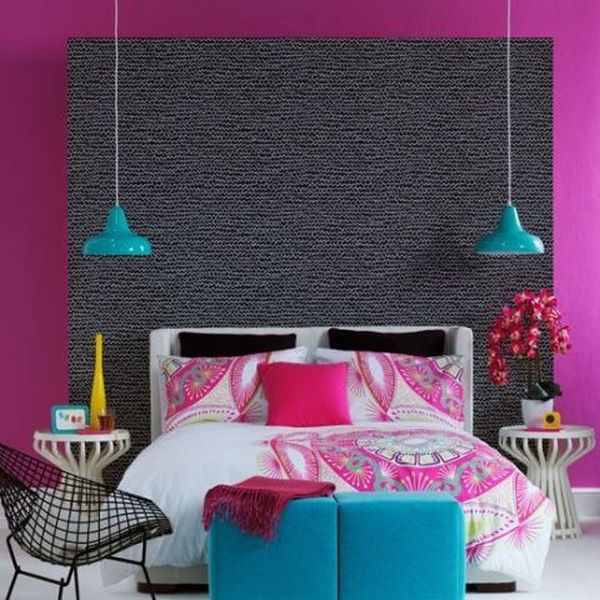
What is complementary color scheme? What are its variations? How to combine colors to create interior designs based on the color wheel and the different shades and tones? We shall look at the principles of using this particular scheme and will look at the most popular combinations used in interior design. The photos in the gallery will show you how imagination, experience and good taste can transform any room into a fantastic place, full of life and vibrant atmosphere.
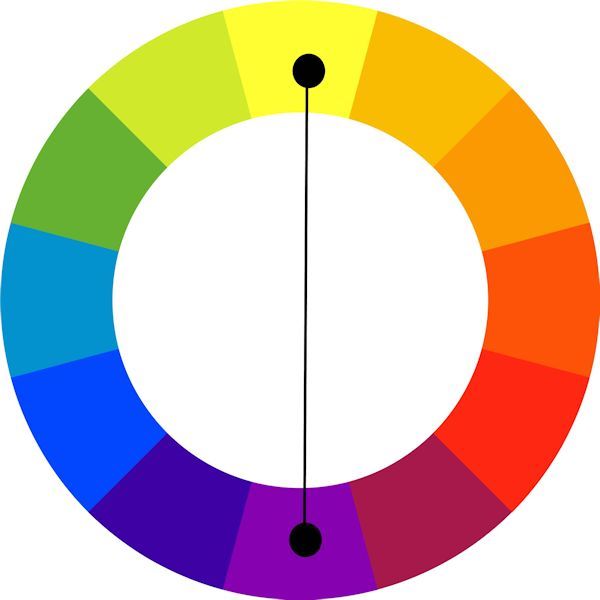
Complementary color scheme is created by using two colors opposite each other on the color wheel. This is the most contrasting of all color schemes which attracts the most attention and one of the main challenges when working with it is to achieve a harmonious balance. The strong contrast of complementary colors can be very bright; especially if you use every color in its full saturation. Due to the fact that this scheme is a combination of warm and cold color, when it comes to interior design (and not only) you need to carefully consider which of the two colors will be the dominant one. Usually, when using a contrasting color scheme, it is important to choose a main color and use an additional one for accents. This choice will set the appearance of the final result – your interior will look warm or cold. Some designers choose to reduce the saturation of the colors and use soft, warm shades, which makes the contrast softer but still maintains the balance of the composition.
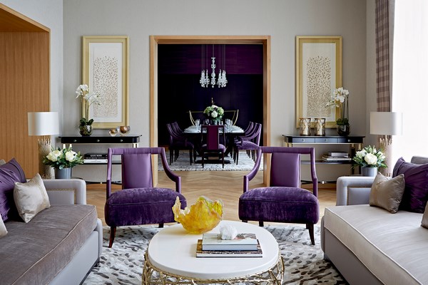
This color scheme is useful when you need to highlight something as it focuses the attention towards a particular object. Often, interiors decorated with a complementary combination of colors look more formal and are usually used for living rooms or dining rooms when the goal is to achieve a more impressive and dramatic interior. As we said, in their most basic form, complementary color schemes are based on two colors, but can be expanded by adding shades with different saturation and intensity.
What is Split complementary color scheme?
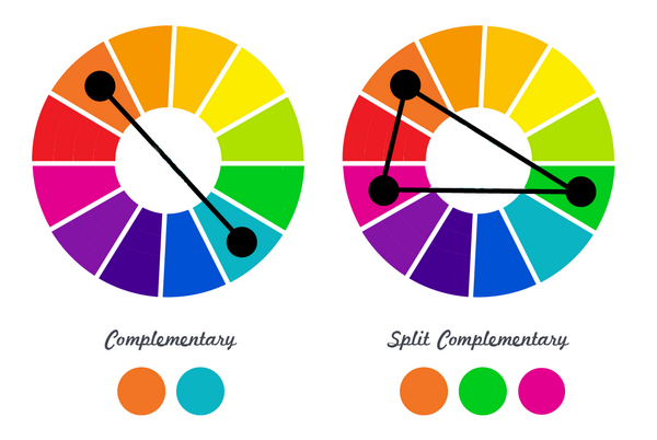
Split complementary color scheme is a variation of the complementary color scheme where the main color is combined with the two colors adjacent to its complement color which is excluded, for example yellow and green + red. The result is a scheme of three tones which still has a strong visual contrast but not as strong as in the basic scheme of two colors and more pleasing to the eye. Split complementary contrasts also looks spectacular, but are more refined, it is much more difficult to make mistakes and that is one of the reasons why these combinations enjoy great popularity in design and artwork.
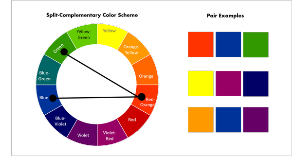
Compared to other schemes, the split complementary one provides the greatest opportunities for variations and it is exceptionally flexible as you can change either the main color or the distance between adjacent colors. However, you must always observe the rule for distance and symmetry between the three colors.
How to use complementary color scheme in interior design and create a harmonious environment?
Colors can be ideal partners or enemies and without any doubt, they can affect the mood of a person and influence our emotions. Some combinations create a sense of calmness while others cause internal tension and discomfort. When you are in a room decorated with bright colors, a person feels vivid and energetic but excessive saturation can be extremely tiring for the eyes, so experienced designers choose softer tones, and dilute the contrast with neutral colors.
Each color on the wheel has its opposite – for example red -green, yellow – purple, blue – orange. These are exciting and expressive combinations, which add visual interest to the interior but you should remember that they have to be used with caution. When you want to use complementary color scheme you need to decide where and how you are going to use the colors in the room. Another consideration that you need to keep in mind is the openness of the room, i. e. – is it visible from other rooms? Using contrast colors correctly, you can also zone the room and define the functional areas in an open plan living space. Remember, that it is not recommended to use both colors in equal parts or to mix them in pure form without neutral (white or gray) colors to balance the contrast. Split complementary colors help giving the interior some extra character and the interior looks more refined.
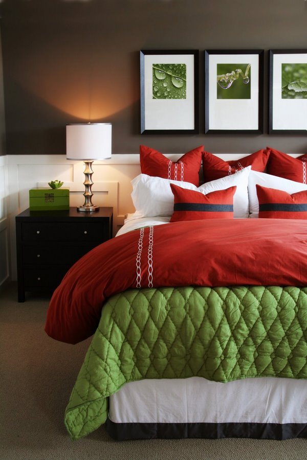
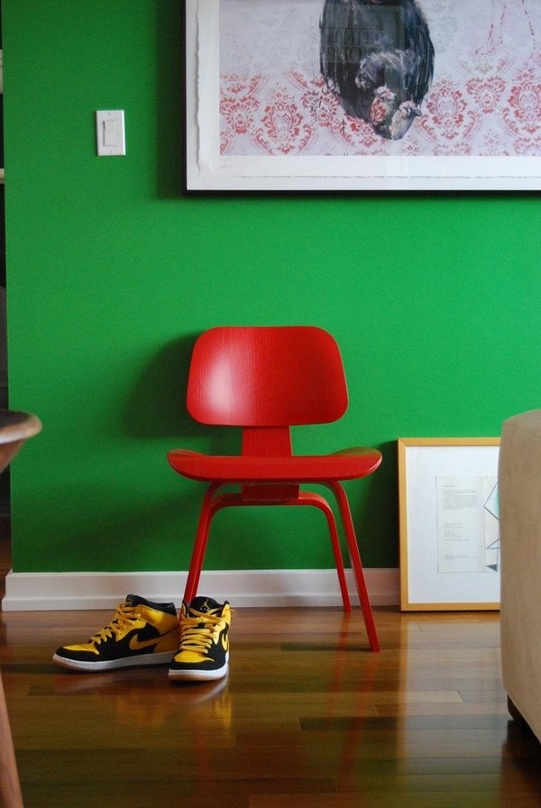
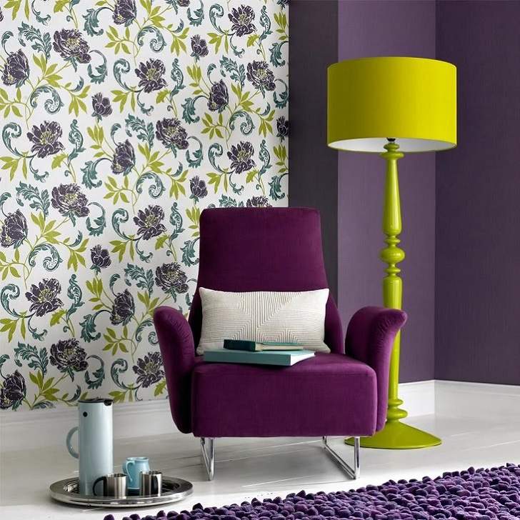
The most popular complementary colors are red-green, blue-orange, purple-yellow and. Red and green combination immediately makes us think of Christmas and the bright and saturated of the holiday create a festive mood. However, in interior design you can combine a variety of red shades – from scarlet and crimson to magenta and burgundy, with green ones which can range from bright and grassy, sage and olive or deep dark forest greens.
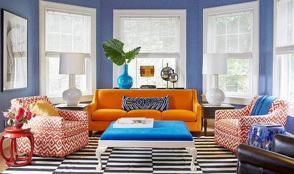
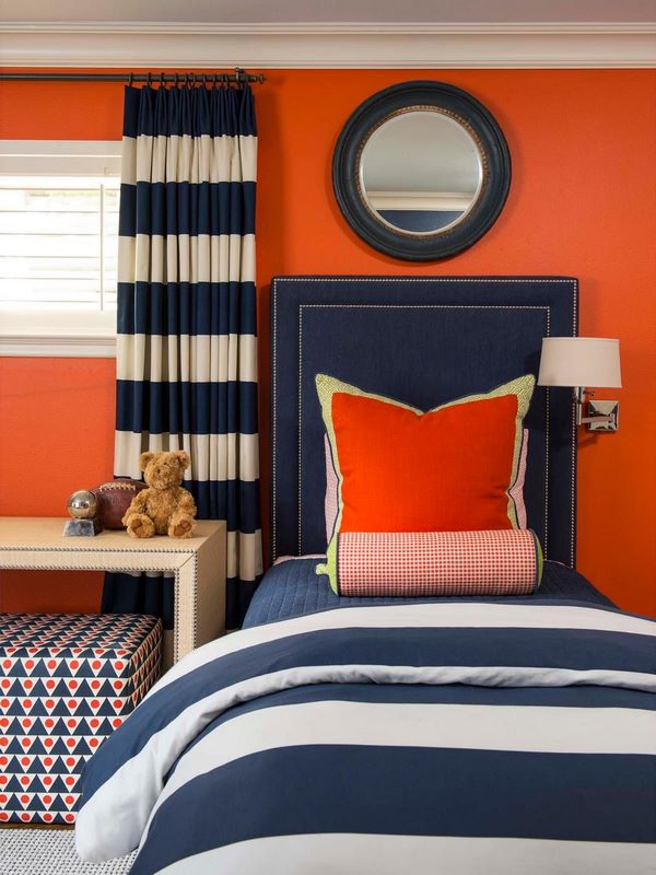
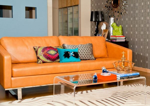
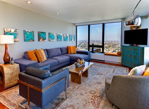
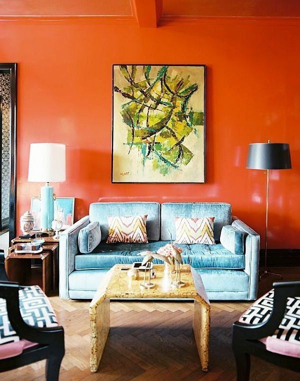
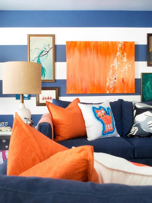
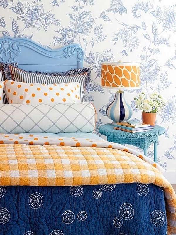
Blue and orange is another dynamic combination where blue belongs to the cold half of the wheel while orange is a hot and bright color. This combination works with both saturated and lighter blue shades as the orange pops brilliantly.
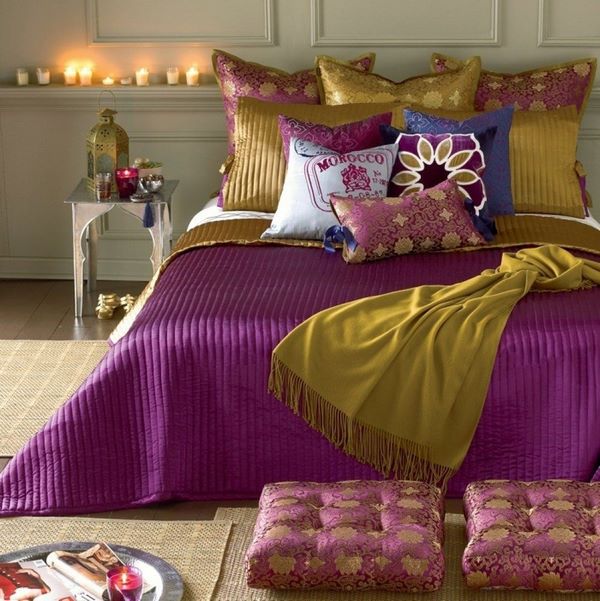
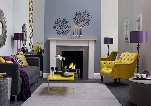
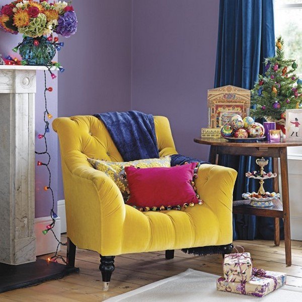
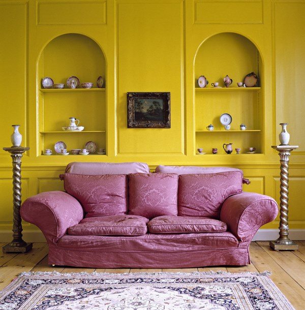
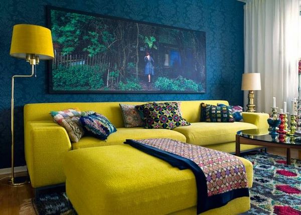
Purple and yellow is exceptionally rich combination and saturated shades can be used for interiors in Boho chic, Moroccan or Ethic style interiors where expressiveness of colors is deliberately sought after.
Look at the gallery and see how complementary colors can be used in amazing interior designs.